Design guidelines for Red Hat Developer Hub (RHDH)
Author: Shiran Hirshberg | Last edit: July 23, 2025 | Design type: Definitions | Product area: Red Hat Developer Hub
🎓 What is RHDH?
RHDH is based on Backstage.io which is a platform created by Spotify, it is a platform for building developer portals. We design a product for the developer persona to help them find all what they need for their work in one place (components, repositories, APIs, applications, documentation and more). The Backstage, as well as RHDH, is all about plugins, anything you see is a plugin that adds more pieces of interface into the product. For example, it could be a navigation item that shows a full page, or a content below a tab on the component view. There are Core Backstage plugins like the Homepage, Catalog and search and there are other plugins that users can install based on what they need (you can find a list of all plugins here).
Learning materials
Our users (slide)
- Administration perspective: We are aiming to improve the admin users as they will be the person who will install the RHDH and will take care to manage and maintain it. There are some features we are working on for this persona as are in the Administration Figma file. We have two personas that will play the role of admin AppDev ITDM and Platform engineer.
- Developer: These users will be the end-users of the RHDH. We want to help them be focused on the work they need to do and surface for them only what is relevant from them. We do not want to copy what is in the Developer perspective in Open Shift.
Try RHDH
You can create a temporary instance (8 hours) of RHDH by following this steps:
- Go to demo.redhat.com
- Click on “Red Hat Developer Portal” and then click “Order”
- Choose “Practice / Enablement” and then “Learning about the product”
- You will get a link and username and password to login (use the GitLab account)
Otherwise, you could try RHDH Local. Here is a step-by-step guide.
Useful links
🎓 What should I know before designing a plugin for RHDH?
As mentioned earlier, every element you see on RHDH is a plugin, except for the main layout. When designing for RHDH, please consider the following:
- What: Determine the purpose of the plugin you are designing
- Who: Ensure that the plugin you design assists the platform engineer or developer persona
- Where: You can create a plugin that adds content to a component overview page, such as adding a tab, or create a plugin that adds an entirely new page with a new navigation item. You can decide whether the plugin you design fits into any part of the product or if it should have its own page
- How: We use material design components, not PatternFly. Please use our Figma library, which contains all the components you need. If a required component is missing, please refer to the Material Design component library. We also use icons from the Material design icons pack
It's important to note that the team responsible for implementing this plugin will maintain it. The RHDH team is available to assist with any questions you may have.
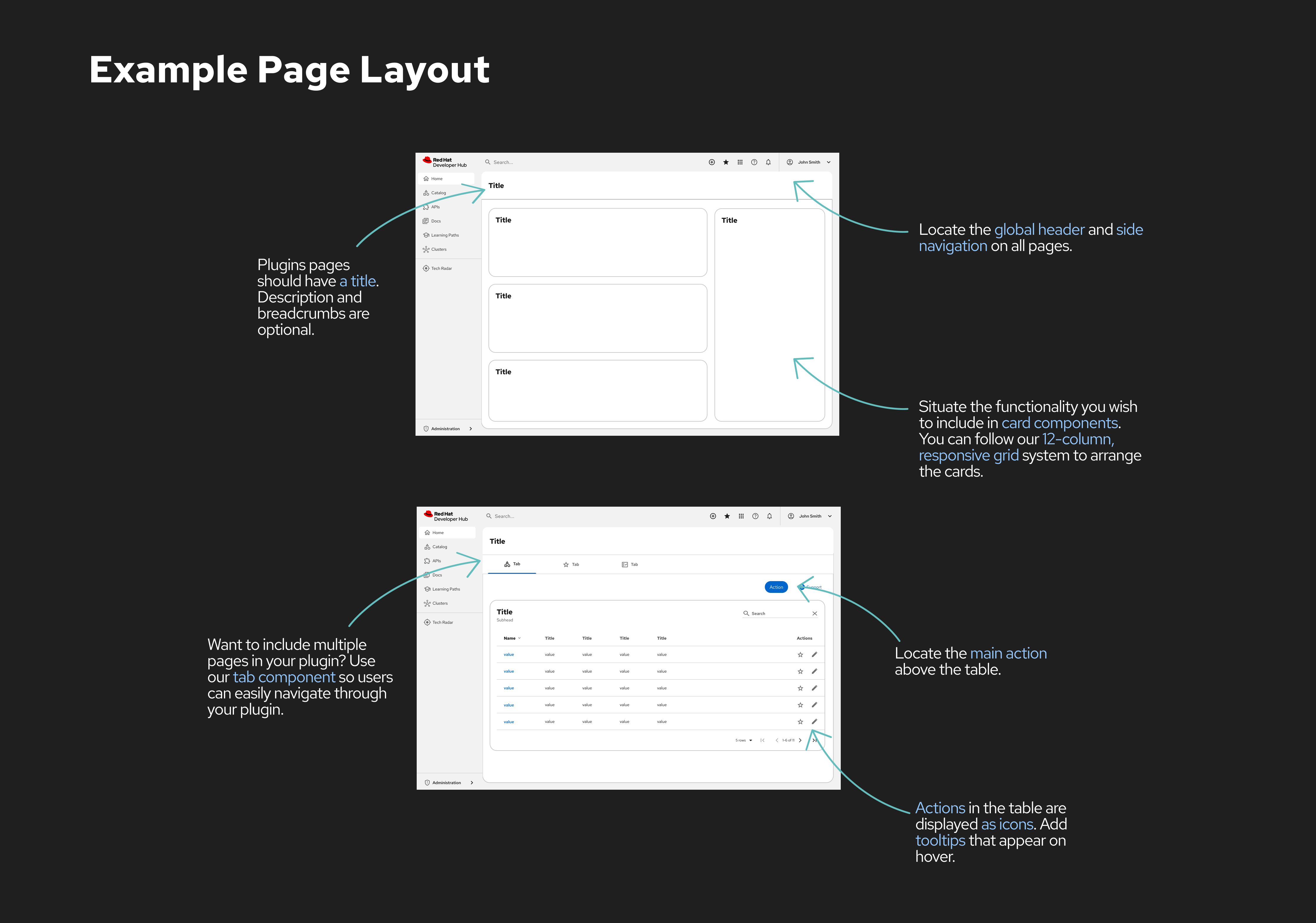
🎓 What is the RHDH layout?
You can find the main layout for building your plugin on our Figma file. If you create a new page for your plugin, please ensure that you follow these guidelines:
Plugin Name and Icon:
In the side navigation, specify the plugin name and select an icon to represent it. The icon should be white, as the navigation has a dark background. If you have an icon representing your product, you can use it, otherwise, you can find an icon from the Material Design Icons pack (download an SVG file to use it). We recommend using outlined icons but it we properties readability, so in case the outlined version of the icon is not clear, please use the filled icon.
Plugin Header:
We recommend using the same name for the plugin in the side navigation as the page title to prevent confusion. In the header, you can add a three-dot menu in case you need it for settings or other infrequent actions. If you want to use tabs, they should appear right after the header, as shown in the example below.
Content Layout:
The page content layout is up to you, most of the time we use a one or two-column layout. Any content should appear inside a card, as the page layout is responsive and can be changed depending on the installed plugins.
Actions:
Please ensure that you add only one main action on each screen using the primary button. Actions appear above the table cards, as this is the standard layout from Backstage. The main button can be a dropdown in case there are more than 2 actions you want to add to this page.
Support Links:
If you'd like to add a support button with links for users to read more about your plugin, please place it on the right-hand side of the main button, as shown below. The support button opens a menu that can include several links.
🎓 What component should I use?
Since Backstage utilizes Material Design components, we kindly request that you use the RHDH library in Figma. You can find all the components we use there. If you need another component that is not in the RHDH library, please obtain it from the Material Design library.
🎓 What colors should I use?
We adhere to the PatternFly color palette. In Figma, you have the option to use this library, and we follow the same guidelines described here.
🎓 Where I can find designs of existing pages?
Please don't start your plugin design from scratch. We've already made some Figma documents that you can use. Just pick one and make your changes in a new Figma file. It'll save you time and make things easier if you use the components we've already created.
You can find all of the Figma Core pages here, and all of the plugin designs in the RHDH Plugins folder.
When you design a new plugin for RHDH please add it to the "RHDH Plugins" folder.
Example document to start with is here, feel free to duplicate it and change based on your need.