Help in the UI
Author: Kevin Hatchoua | Last edit: March 21, 2023 | Design type: Details page | Product area: Hybrid Cloud Console
Tooltips
Tooltips can be used to explain what an element in your UI might be. For example, a user might want to hover over an icon to see what the icon signifies.
Tooltips should be used when the information is very short. When you have a lot of information to include, you should probably differ from a popover. Common use cases for tooltips include explaining why a button is disabled, explaining what an icon is etc.
Popovers
Popovers can also be used to explain what an element in your UI might be, or to give more information to a user without having to navigate them elsewhere. They are different from tooltips in that they are activated by click, and contain much more information.
How is a popover used?
Popovers are commonly used in forms, although they can be used anywhere, including tables or details pages. A user can trigger a popover by clicking on an UI element, which will bring up a “dialog box” with more information. The user can then X out of the dialog box when “done”. You may include pictures and links in popovers, which you can not do in tooltips.
What are the different ways I can present a popover?
- Outline question-mark icon
: Should use this method in almost all cases, using the button and icon components (example uses the X icon)
- Blue link button: Only advised for instances where there may be a large number of popovers on one page, and having icons would add a lot of clutter
- Dotted underline: Although not the recommended approach you may use this in cases where using too much blue or icons would be distracting
How should I present a popover depending on the context?
In a form
Always use an icon next to the form label. The icon should be an unfilled circle with a question mark (fa-question-circle). When a user clicks on the icon, a popover should come up.


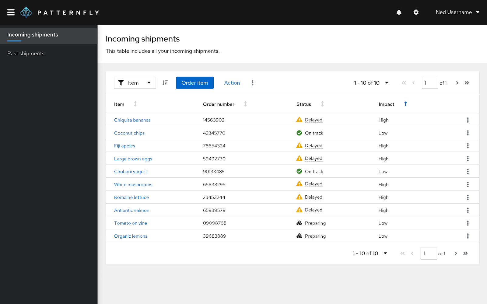
In a table
This study found that it is most favorable to use either the question-circle icon, or blue text.
In a page
When there are minimal instances of ‘helper text’: Use the question-circle icon
When there are many instances of ‘helper text’: You can use blue text, or use a dotted underline, although the dotted underline should be the last resort (only open shift currently does this, and a component for this doesn’t exist in PF so it would have to be custom).
Again, in both cases, clicking on the link or on the icon would bring up a popover.

Question-circle icon styling
The default question-circle icon color is grey when the user is not interacting with it and it is just sitting on the page. Once the user hovers over it, or clicks on it, it becomes black.

Blue text
(with or without status icons) can be used for links and popovers without throwing folks off. Users perceive blue text to mean “I’m clickable!” and seemingly don’t care if a popover appears instead of a new page. Blue text is probably the best pattern to use for popovers with dynamic information or widget-like interactions.
Dotted underlines
are generally more discrete, are normally used to indicate hover ability, and had lower satisfaction ratings in our study, but task completion wasn’t greatly impaired. This pattern could be used sparingly for situations where a ton of blue text or a ton of question mark icons may not be desirable. Dotted underlines probably shouldn’t be a PatternFly pattern until a more obvious use case for them arises.
This study was also a great opportunity to try out Amazon Mechanical Turk. Even though our free response question was optional, many participants took the time to comment on the discoverability of each option and whether their expectations were met, which was great. AMT isn’t the best tool for every question, but the speed at which responses can be collected for certain questions is really great.
Design variations tested
Blue text with icon:

Dotted underline with icon:
Blue text:

Dotted underline:

Question mark icon:
